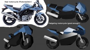
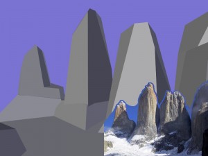
We’ve talked about how not to do graphics, how to not make them overly complex or deceptive. But visuals are important to games, especially as a communication channel. Here are some examples of what we expect the visuals to look like in Fledgeling.
Things are going to look representative of their real-life analogues. The intent is to make things look recognizable as the real objects, without making them look like they would if you were to take a photograph of them in real life. Ludo-realism is our goal, not photo-realism.
Objects will be deeply nested and procedurally populated, so what you’re looking at always has the potential for more complex structures inside it. However, you don’t need to deal with that complexity all the time. and the game certainly won’t always be showing it.
I hope these couple of examples help to illustrate the kind of presentation we expect out of Fledgeling. There will be more of these posts as we develop the geometry generation prototype code.


